Mobile experience begins with information order
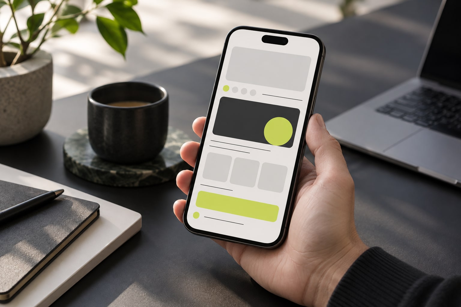
Mobile design is more than scaling a desktop page. Platform choices, transaction status, return paths and explanatory text compete for limited space. The first design question is whether users can recognize what matters.
Understanding the context
Mobile design is more than scaling a desktop page. Platform choices, transaction status, return paths and explanatory text compete for limited space. The first design question is whether users can recognize what matters.
The important distinctions
Comparison tables benefit from stable row labels and deliberate horizontal scrolling. Articles need readable line lengths and section navigation. Converting everything into cards can hide relationships rather than improve usability.
Comparison tables benefit from stable row labels and deliberate horizontal scrolling.
Using this information
Touch areas, on-screen keyboards, text enlargement and wide tables affect real use. Evaluate whether a reader can finish discovery and reading tasks, rather than judging only a first-screen image.
A comparison needs relationships
Breaking every table field into a separate card can make cross-platform reading harder, even if each card looks tidy. A stable first column and a deliberately scrollable data area preserve the connection between a criterion and its values. Horizontal movement should have a visible boundary rather than moving the entire page. The reader needs to retain the platform name, the criterion being examined and the meaning of unknown information. A successful mobile comparison protects these relationships while adapting the available space.
The rhythm of reading and acting
Articles need a steady reading rhythm, filters need clear feedback and comparison selections need removable labels. These tasks can share typography and color without sharing the same layout. Keeping the visual language consistent while adjusting density for the task lets an editorial publication and a practical tool coexist. The interface should explain each transition from reading to filtering to comparison rather than leave the user guessing whether an action changed anything.
A small screen is not a scaled desktop
Mobile design should reorder information, not merely compress columns. Readers need to know the subject, criterion, unknown state and next action; without stable labels, even a complete table becomes unreadable. Responsive techniques adapt layout, but must be tested across widths and text zoom. One home-page screenshot cannot represent every reading state.[3][1]
An article needs readable line length, heading hierarchy and section navigation. A filter needs visible selections and result counts. A wide table needs stable labels and a clear scrolling boundary. Turning everything into cards can destroy cross-platform comparison. Choose a layout for the relationships in the information rather than imposing one mobile aesthetic on every task.[3][1]
Touch and accessibility affect the task
Touch has no mouse-hover state and fingers are less precise than a pointer. Conditions hidden in hover text, tiny icons or unlabeled controls can be missed. W3C places mobile and input variation within accessibility guidance; WCAG 2.2 target-size criteria offer one check, subject to their exceptions and conditions. Passing a size check alone does not establish that a page is accessible.[1][2]
A full check also covers keyboard focus, accessible names, error messages, form feedback and current states. If a payment or filter reports success only through color, some readers may not recognize it. Record the task, the step that blocks it and the input method. That is more reproducible than an unqualified claim of WCAG conformance or “mobile friendliness.”[1][2]
Align interface states with data states
A directory may distinguish confirmed support, unknown and confirmed lack of support. If a mobile layout renders all three as the same blank, it hides differences in evidence. Use text or accessible labels that remain distinguishable on small screens, and retain verification dates and sources. This is not decorative polish; it prevents missing data from being read as a negative finding.[3][1]
Long pages need reliable position cues. Table-of-contents links, heading anchors and browser navigation should work with touch and keyboard; switching language should retain the article instead of returning to the home page. W3C’s language-tag standard explains why language identification matters, while translation completeness must be checked in the page itself, not inferred from a language switcher.[4][1]
Measure whether the task can be completed
A useful mobile evaluation starts with a real task: find a payment scope, read a long guide, identify a transaction status or compare conditions. Record the device, browser, orientation, text zoom, network and outcome. Repeating the same task makes releases comparable. A mock-up or first-screen load time alone does not show whether the whole flow can be completed.[1][3]
Describe observable effects rather than labeling an experience “bad”: a column label disappears during scrolling, a keyboard covers an error, or a language switch resets the reading position. These are diagnosable and fixable. Retest in the same environment after a change and state which devices remain untested. This reports evidence without turning one phone’s behavior into a universal rating.[1][2]
Process and observable records: A comparison needs relationships
Understanding the context is easier to understand when mapped as observable events: who initiates an action, which system receives it, what record marks a state change, and when an external party can verify the result. The map should not assume that every service uses the same architecture; it translates interface language into questions that evidence can answer. For “Mobile Web,” A service accessed in a mobile browser, distinct from native applications or store availability. Readers can then ask who produced the record, whether the result is reproducible, and which release or location the description covers. If a page says only “supported” without conditions, the accurate conclusion is that the evidence is incomplete, not that a familiar implementation can be assumed.[1]
Consider a concrete case: a user submits a request on an unstable connection, the screen remains in a pending state, and a separate system later sends a notice. None of those signals alone proves success or failure. Compare timestamps, identifiers, direction and record owner, then state which stage each record can establish. “Platform Compatibility” helps frame the question because The scope of device, browser and operating-system support, verified for specific versions. This is a process example, not a promise about any particular service. When the records cannot be matched, preserve the uncertainty and name the missing evidence. That is more useful to readers than turning an ambiguous notification into a definitive account of what happened.[2]
“Responsive web design,” published by MDN Web Docs, supports this bounded point: Introduces responsive layout, fluid content and multi-screen design. Keep the document’s direct statement separate from editorial inference. The former should be traceable to the linked passage; the latter needs an explicit reasoning step and language that identifies it as interpretation. “Native App” is a related concept in Using this information: Software built for a particular operating system, requiring publisher, version and distribution checks. A source that does not discuss a particular product, jurisdiction, release or user condition cannot settle those questions by silence. Stating these limits tells readers whether the conclusion can be carried into a different context or needs fresh evidence.[3]
Source scope and comparison: The rhythm of reading and acting
A common source of confusion is not one term but the collapse of adjacent stages. A request, authorization, processing step and updated account display may be recorded by different systems. Calling every stage “complete” leaves readers unable to tell what occurred or which party can resolve a discrepancy. Put “Mobile Web” back within its stated boundary: A service accessed in a mobile browser, distinct from native applications or store availability. Check the subject, verb, timestamp and record owner in each claim. Where different documents use different definitions, retain the original terms and explain the difference instead of smoothing them into synonyms for readability.[1]
Before comparing two figures or capabilities, fix the subject, definition, time window, process direction and calculation method. For “Platform Compatibility,” The scope of device, browser and operating-system support, verified for specific versions. If the denominator, release or observation period differs, the values cannot be placed side by side without qualification. Mark a missing field as unknown and explain how it limits the conclusion rather than estimating it away. A tidy table can make an invalid comparison look precise. When conditions cannot be aligned, “not comparable from the available evidence” is an informative result; list what would make a future comparison possible.[2]
Use “who controls which step?” to inspect the system boundary. A front end may display status, an external service may process a request, and a separate ledger or network may keep its own record. Similar labels do not prove shared data or give one party control over another system’s result. Use “Native App” according to its actual definition: Software built for a particular operating system, requiring publisher, version and distribution checks. Describing control, visibility and responsibility separately prevents a component from being presented as a guarantee about the whole service. To verify a claim, start with the record closest to the event and check that it covers the stated subject and time.[3]
Interpretation and maintenance: A small screen is not a scaled desktop
Readers can carry three questions into the next page: who is the claim about, which record supports it, and what conditions remain unstated? If the only evidence is a brand statement or a single screenshot, narrow the conclusion to what that material can show. “Mobile Web” is a concept for defining the question, not a quality label: A service accessed in a mobile browser, distinct from native applications or store availability. This distinction matters when reading directories, policy pages and technical documents, where short fields often omit scope. Marking uncertainty does not make analysis less useful; it lets readers separate established facts, reasoned interpretation and open questions.[1]
These topics need separate update clocks. A concept may remain stable while rules, software releases, fees or service procedures change. On revision, record the check date, source version and fields that changed; preserve the original publication date so readers can distinguish the background article from later verification. The scope checked in “Understanding Success Criterion 2.5.8: Target Size (Minimum)” is Explains the WCAG 2.2 minimum target-size criterion and its exceptions; it cannot confirm the current state of an individual service. Apply the same discipline to “Platform Compatibility”: The scope of device, browser and operating-system support, verified for specific versions. If new evidence changes one condition, revise that claim alone instead of turning a background explainer into an unverified live update.[2]
Make the analysis reproducible: copy the original claim, record the source title, publisher, URL, check date and scope, distinguish directly supported sentences from editorial interpretation, and list what remains missing. For another angle, continue with “Industry context: browser-first product architecture”: Browser delivery creates a common entry point across devices without guaranteeing identical features. Screen size, input methods, connectivity and operating systems affect the result. This background analysis concerns architecture rather than a new corporate announcement. The link adds context or a conceptual comparison; it does not mean both articles share evidence or endorse a service. Keep “Native App” within its definition: Software built for a particular operating system, requiring publisher, version and distribution checks. This record gives the next editor a way to investigate a disagreement, update a reference and preserve the reasoning behind the published wording.[3]
Evaluate whether key tasks work on a phone: reading, input, correction, zoom and orientation changes. Standards provide checkable baselines; hands-on tests expose loading, obstruction, focus and one-handed use problems. Mobile support is more than a page opening. Content order, instructions and important states should remain understandable on a small or magnified screen; a loaded feature can still be unusable.[1]
Categories
Keep exploring
Sources and scope
- Mobile Accessibility at W3CW3C Web Accessibility InitiativeChecked:
Explains how WCAG and related standards address mobile, touch and varied input modes.
- Understanding Success Criterion 2.5.8: Target Size (Minimum)W3C Web Accessibility InitiativeChecked:
Explains the WCAG 2.2 minimum target-size criterion and its exceptions.
- Responsive web designMDN Web DocsChecked:
Introduces responsive layout, fluid content and multi-screen design.
- Language Tags and Locale Identifiers for the World Wide WebW3C Internationalization Working GroupChecked:
Explains language tags and locale identification for web content.